

UX in the Wild
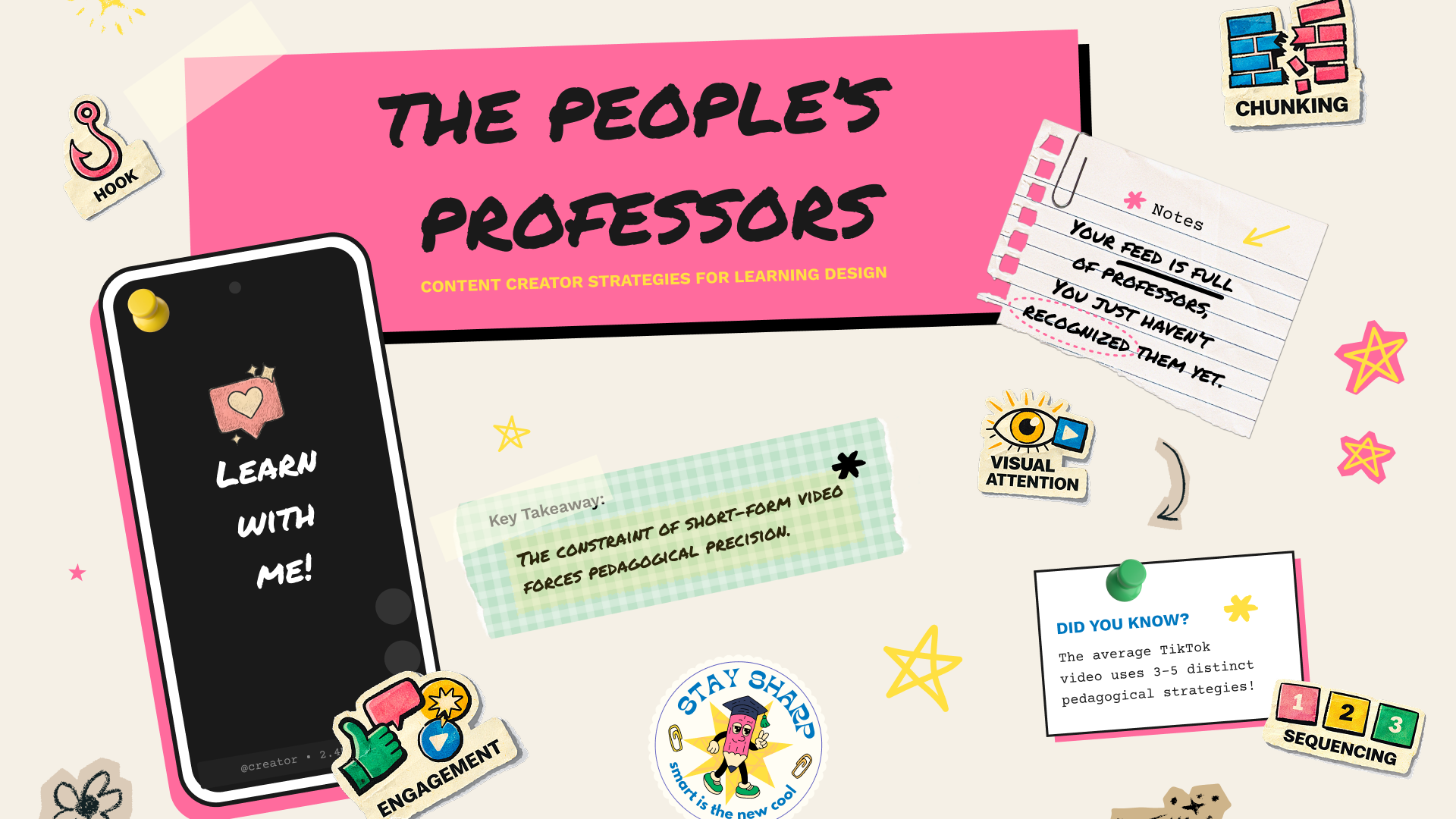
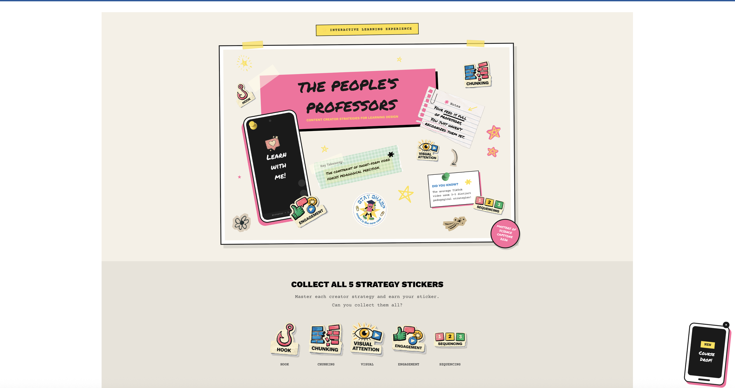
The People's Professors: How I Built a Course About TikTok Teaching Strategies
What if the most effective teaching techniques aren't coming from universities—but from your For You Page?
That question sparked my capstone project: The People's Professors: How Content Creators Democratize Education Through Short-Form Video. It's an interactive learning experience that teaches instructional designers to apply five creator-derived strategies—Hook, Chunking, Visual Attention, Engagement, and Sequencing—to workplace nano-learning.
My capstone project journey, mistakes and all
Where This Started
I kept noticing something weird.
I'd scroll through TikTok and actually learn things. A woodworker would teach me about grain direction in 45 seconds. A makeup artist would explain color theory as she did her morning routine. A language teacher would have me repeating Spanish phrases before I realized I was being taught.
Then I'd go to work and sit through a 45-minute compliance module where I clicked "Next" seventeen times without absorbing a single thing.
Something didn't add up.
That frustration turned into my capstone project: The People's Professors: How Content Creators Democratize Education Through Short-Form Video. It's an interactive learning experience that teaches instructional designers to apply five creator strategies (Hook, Chunking, Visual Attention, Engagement, and Sequencing) to workplace nano-learning.
The thesis I kept coming back to: the algorithm has become the new syllabus. Creators learn what works through views, likes, and watch time. The strategies that survive the scroll? They're backed by the same learning science that took educational psychologists decades to figure out. Creators just got there through trial and error, not textbooks.
The course's central thesis
The Problem I Wanted to Solve
Here's what I've seen over and over in my career: learners hate traditional eLearning. Designers create these long modules, learners click through to check a compliance box, and nobody actually remembers anything a week later.
There's this huge gap between how people naturally consume information now (short, visual, engaging) and how most organizations deliver training (long, dense, text-heavy).
But TikTok? People are genuinely learning there. Researchers Khlaif and Salha actually studied this back in 2021. They found that the 60-second constraint forces clarity. One concept, one takeaway, maximum retention.
I wanted to bridge that gap. Take what creators do instinctively and make it teachable for learning designers like me.
Finding the Right Look (After Getting It Wrong)
I'll be honest: my first visual direction was completely off.
I almost went with this fantasy theme. "Kingdom of Engagement." "Pedagogical Artifacts." It felt clever at the time. But something was bugging me about it, and I couldn't figure out what.
Then I landed on the zine aesthetic, and everything clicked.
Think about it. Zines were the original democratization of publishing. Before the internet, anyone with a photocopier could become a publisher and bypass traditional gatekeepers. That's exactly what content creators are doing now. They're democratizing education by bypassing traditional academia.
Zines Creator-Educators Photocopier access Smartphone + platform Bypassed publishers Bypassed universities Raw over polished Authentic over produced Community distributed Algorithm distributed
The DIY scrapbook look isn't just for aesthetics. It is the argument, visually. The medium reinforces the message: education doesn't need to be slick and institutional to be effective.
Rules I Set for Myself
I came up with some principles to keep the "messy" look purposeful:
Democratic over polished. It should feel accessible, not exclusive.
Energetic over static. Rotation and visual "noise" create movement.
Mixed over uniform. It should feel assembled, not templated.
Readable over decorative. Accessibility always wins.
Meaningful over random. Every element should serve communication.
That last one saved me more than once. I got feedback on an early design that it looked "messy," and they were right. I had added decoration without purpose. The fix wasn't to abandon the zine vibe. It was to be more selective. A yellow highlight here, a pink shadow there, one tilted stamp. Controlled chaos instead of just chaos.
Learning to Code
I'm not a developer. I don't have a CS degree. But this project needed custom HTML, CSS, and JavaScript to work in Articulate Rise, so I figured it out as I went.
I call it "vibe coding." Work iteratively. Use browser developer tools to inspect and fix things. Build through trial and error. Google a lot. Ask for help when stuck.
What I Used
Articulate Rise for the base platform
Mighty Plugin for CSS and JavaScript injection
GitHub for version control (this became essential)
SCORM Cloud for deployment and testing
Browser DevTools constantly, for everything
Version control became essential as the codebase grew
Debugging CSS hover states in the browser
The Custom Stuff I Built
Rise is great out of the box, but it doesn't have everything I need. So I built it.
The Sticker Collection System
Learners earn stickers by passing quizzes, one for each of the five strategies. A floating sticker book tab shows their progress, and watching those stickers fill in feels genuinely rewarding.
This was harder than I expected. The sticker book needed to only appear in certain lessons, remember what learners had earned across page loads, lock rewards behind quiz completion, and celebrate when someone finished their collection.
I went through so many versions. We're on v20 of the storage key at this point. Lots of edge cases to work through, like what happens when someone navigates away mid-quiz or refreshes the page.
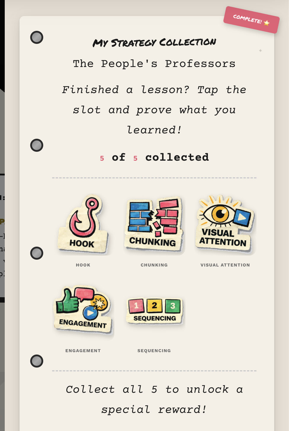
The sticker book with quiz-gated rewards
"The Algorithm" Chatbot
This is a little helper that follows learners through the course. Ask it, "What's a hook?" and it explains. Say "I'm stuck," and it offers encouragement. It even knows which lesson you're on and changes its greeting.
I styled it to match the zine look. Torn paper edges, tape decorations, typewriter fonts. But it's also packed with content about all five strategies and the learning science behind them.
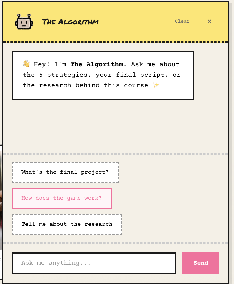
"The Algorithm" provides just-in-time support
The Script Template with Automated Feedback
This is where the learning gets real. Learners write their own 60-second video script, and the tool gives them instant feedback based on all five strategies. It scores each one on a 1-4 scale with specific suggestions for improvement. Not just "you got this wrong" but "here's how to make it better."
They can download their script as a PDF with their scores, so it becomes a portfolio piece.
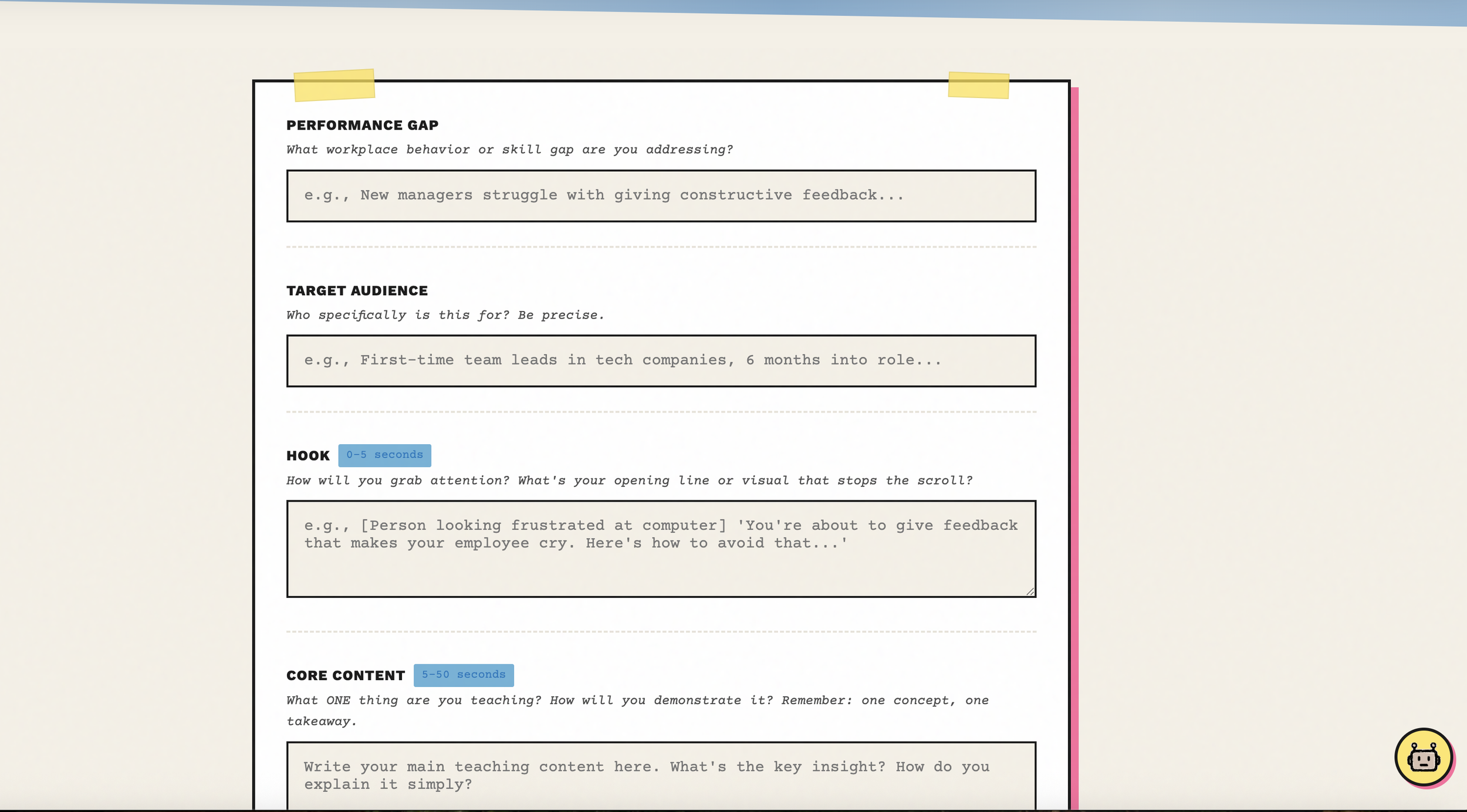
The script template with automated rubric feedback
Custom Visual Dividers
Rise's default dividers are fine but generic. I created torn paper edges, washi tape strips, and paper clips with risograph paper. Little things that maintain the zine personality between content sections.
Custom dividers keep the handmade feel
How the Lessons Work
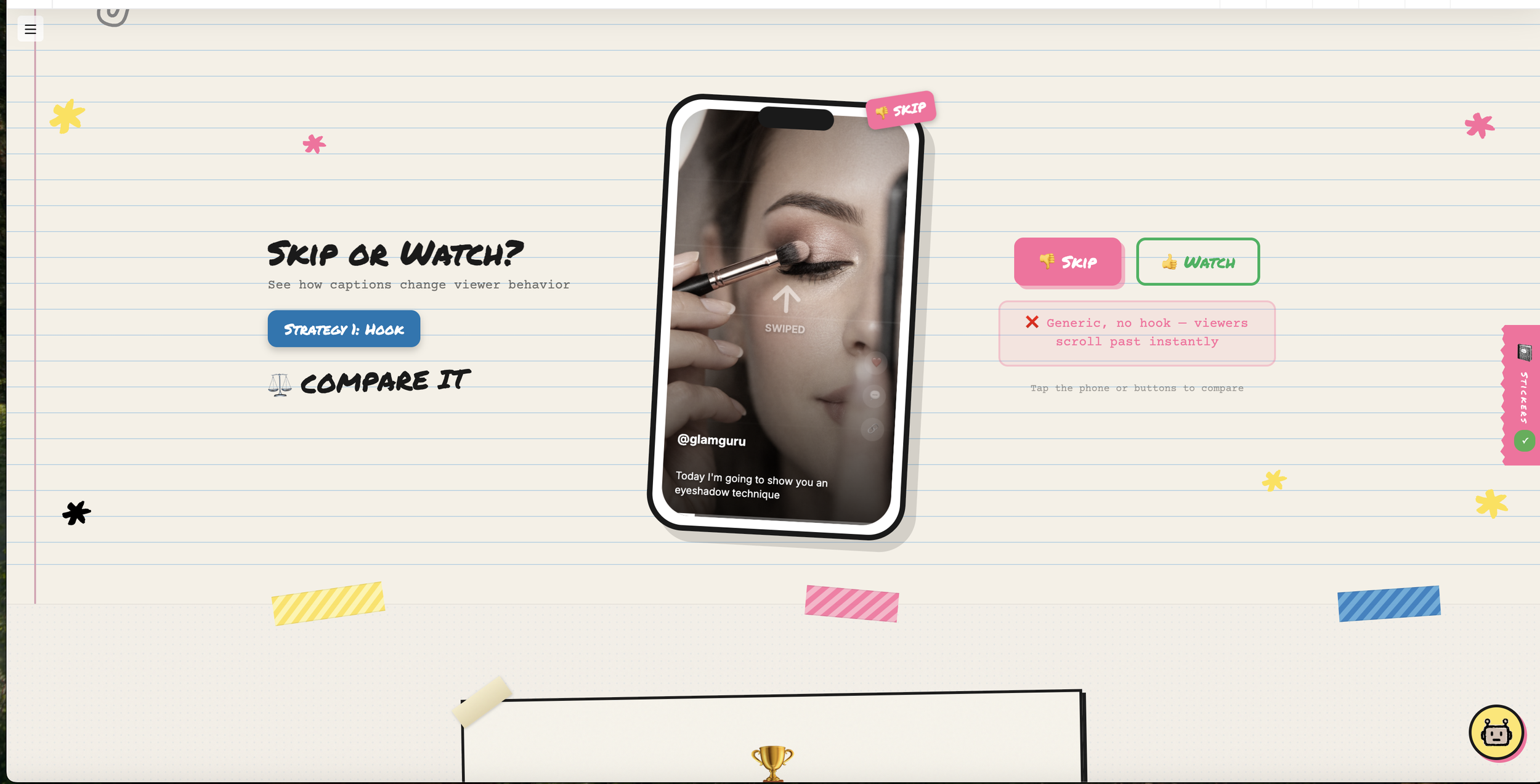
Every strategy follows the same structure, based on Merrill's First Principles of Instruction:
SEE IT - Watch real TikTok creators using the strategy
COMPARE IT - Look at side-by-side examples, effective vs. ineffective
PROVE IT - Pass a quiz to earn your sticker
This keeps things consistent while letting each strategy feature different creators. Makeup artists, woodworkers, language teachers, guitarists. The techniques work across all kinds of content.
And the research isn't just name-dropping:
Mayer's Multimedia Principles shaped the Visual Attention lesson
Merrill's First Principles structured the entire course flow
Vygotsky's scaffolding informed Sequencing
Jenkins' participatory culture grounded Engagement
Khlaif and Salha's TikTok research validated the whole nano-learning approach
Things That Went Wrong (And How I Fixed Them)
The Single-Page App Problem
Rise doesn't do full page reloads between lessons. It's a single-page application. So my sticker book kept showing up everywhere after someone visited the target lesson, because the elements just stayed in the page.
The fix: I had to add continuous monitoring (checking every 500 milliseconds) to see what lesson the learner was on and hide or show the sticker book accordingly. Not elegant, but it works.
The "Too Messy" Feedback
My first showcase PDF came back with feedback that it looked messy. I had to step back and realize I was breaking my own rules. I had added tape, torn edges, and decorations everywhere without thinking about whether they served a purpose.
The cleaner version kept the zine energy through just a few key elements. It ended up looking like a well-designed conference poster that hints at being handmade, rather than overwhelming people with visual noise.
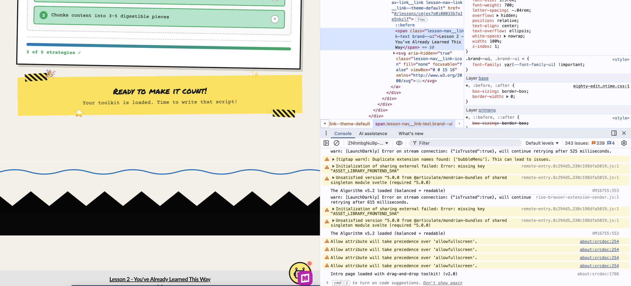
The CSS Variable Discovery
I spent way too long trying to override Rise's hover states with regular CSS and nothing was working. The breakthrough came when I dug into DevTools and discovered Rise uses CSS custom properties internally. I needed to override the variables (like --button-background-hover-color) instead of fighting individual style rules.
Finding Rise's CSS variables was the breakthrough
Misaligned Requirements
My original checklist required learners to use all five strategies in their final script. But the actual learning outcome only said "at least three." That's a problem! Not every video needs all five strategies, and forcing them could feel unnatural.
I had to realign everything so the deliverable matched what I was actually asking learners to do.
What I Ended Up With
The finished course includes:
5 strategy lessons following the SEE IT, COMPARE IT, PROVE IT structure
A gamified sticker collection with quiz gates
"The Algorithm" chatbot for help along the way
A 60-second script template with automated rubric feedback
Custom visual design throughout
A downloadable toolkit for continued use
A feedback survey for evaluation
It's live on SCORM Cloud and part of my professional portfolio at emilygreendesign.com.
What I Took Away From This
On the Technical Side
You don't need a CS degree to build custom learning experiences. Vibe coding is real.
Browser DevTools are your best friend when you're figuring things out.
Version control (GitHub) stops being optional once you have more than a couple files.
Single-page apps require different thinking than regular websites.
On Design
Every visual choice should communicate something, not just decorate.
Constraints (like 60 seconds) force clarity and creativity.
An aesthetic can literally be your argument when it connects to your content.
"Readable over decorative" is worth remembering every single time.
On Instructional Design
Content creators are doing sophisticated teaching work without realizing it.
The gap between casual learning and formal training is worth bridging.
Gamification works when it's meaningful, not when it's tacked on.
Good feedback tells people how to improve, not just whether they're right or wrong.
Try It
The course is live. Scan the QR code below to experience The People's Professors and start applying creator strategies to your own work.

Scan to access the course
Thank You
This was my IDT680 capstone at Full Sail University. Thanks to Dr. Reo and my classmates for the feedback throughout, and to all the content creators out there whose work made me think differently about what teaching can look like.
The algorithm really has become the new syllabus. And I learned a lot from it.
Emily Green is an instructional designer and learning experience designer.
What a Barista Taught Me About Instructional Design
The planning process behind my capstone project, "The People's Professors"

Content creators are onto something….
Last month, I learned how to make a proper cortado from a 47-second TikTok video. The creator wasn't a certified barista trainer. She didn't have a teaching degree. She just knew espresso, knew her audience, and knew exactly how to hold my attention long enough to change my morning routine.
I've spent over fourteen years designing corporate training for Fortune 500 companies. I've studied ADDIE, Bloom's Taxonomy, Gagné's Nine Events. And yet, this woman teaching latte art in her kitchen was doing something I needed to pay closer attention to.
The Accidental Pedagogues
Here's the thing: content creators are teaching complex skills every day. Car repairs, knitting techniques, gaming strategies, makeup application. And they're doing it in 60 seconds or less. They're not formally trained in instructional design. Most wouldn't call themselves educators. But they're using sophisticated pedagogical strategies, whether they realize it or not.
They hook attention in the first two seconds. They chunk information into digestible pieces. They use visual scaffolding that would make Mayer proud. They build participatory communities that drive practice and feedback. They create series that scaffold skills over time.
Meanwhile, in corporate L&D, we're still defaulting to 20-minute eLearning modules and wondering why completion rates are dismal.
Introducing "The People's Professors"
This disconnect became the foundation for my master's capstone project at Full Sail University. I wanted to bridge the gap between what creators do intuitively and what instructional designers do intentionally. My goal was to translate creator-native strategies into actionable practices we can apply to workplace learning.
The result is "The People's Professors," an interactive game-based learning experience where instructional designers analyze real creator content across genres: baristas, mechanics, knitters, gamers. Learners discover five "Pedagogical Artifacts" along the way: hook techniques, cognitive chunking, visual scaffolding, participatory prompts, and series-based learning paths. By the end, they design their own 60-second microlearning video script applying at least three of these strategies to a real workplace performance gap.
How the Planning Came Together
What I love about instructional design is that the process itself is instructive. Each planning document I created built on the last, forming a coherent through-line from problem to solution.
My Training Needs Analysis helped me articulate the performance gap and identify subject matter experts, including researchers like Khlaif and Salha on TikTok as nano-learning, Greenhow and Lewin on social media pedagogy, and Jenkins on participatory culture. Merrill's First Principles of Instruction gave me a framework to structure the learner journey from activation through integration. My Hierarchical Task Analysis forced me to sequence tasks in a way that reduces cognitive load and builds confidence progressively. And my IDD Blueprint synthesized everything into a cohesive design plan.
I recorded a short video walking through this planning process, showing how each document informed the next and how I made key design decisions along the way.
The Takeaway
The biggest lesson from this project isn't about TikTok or microlearning. It's about paying attention to where learning actually happens. The most effective teaching often shows up in unexpected places—your social media feed, a YouTube rabbit hole, a Reddit thread. Our job as instructional designers isn't to dismiss these spaces as entertainment. It's to understand why they work and bring that understanding back to the experiences we create.
Good instructional design isn't about following a formula. It's about understanding your learners, grounding your approach in research, and building experiences that actually change behavior.
Your Turn
I'd love to hear from you: Who's taught you something without trying to? What creator content has stuck with you in ways that formal training hasn't? Drop a comment below or connect with me on LinkedIn. Let's talk about the people's professors in your feed.
— Emily Green

Why Healthcare Needs Ethical AI Training (And Why Most Compliance Training Won't Cut It)
AI isn't going away. Healthcare organizations have a choice: react to violations after they happen, or equip teams with the skills to use AI ethically from day one.
Generative AI is already in your hospital. Your nurses are using ChatGPT to simplify discharge instructions. Your administrators are drafting emails with AI assistance. Your physicians are experimenting with clinical note summaries.
The question isn't whether your team is using AI—it's whether they're using it safely.
The Compliance Training Trap
Most healthcare organizations treat AI training like every other requirement: information dumps, multiple-choice quizzes, and the hope that knowledge translates to behavior change.
It doesn't.
When it comes to AI in healthcare, the gap between knowing and doing is dangerously wide.
What Healthcare Workers Actually Need
Four critical competencies that go beyond "AI awareness":
Ethical prompt engineering - Maintaining patient privacy and avoiding bias
HIPAA-compliant AI use - Knowing what can and cannot be shared
Bias identification - Recognizing when AI perpetuates health inequities
Implementation skills - Integrating AI into workflows safely
These aren't theoretical concerns. They're daily decisions your team is making right now, with or without training.
A Behavior-Focused Approach
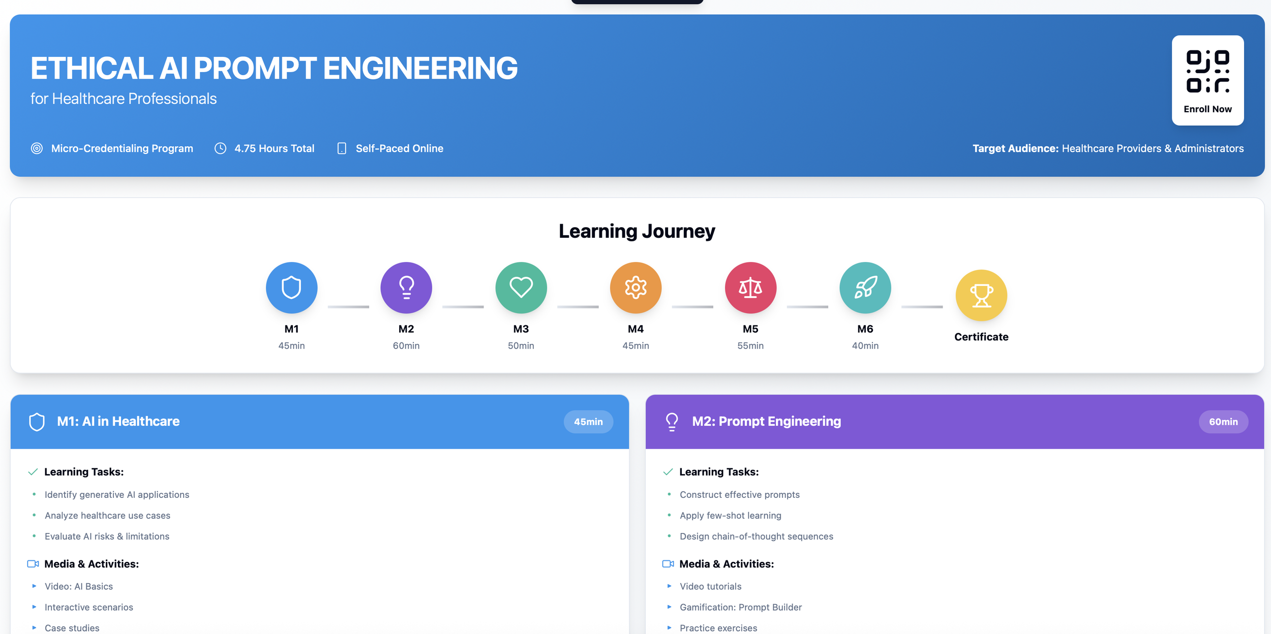
Select the image to visit Ethical AI Prompt Engineering for Healthcare Professionals content map
My new microcredential, Ethical AI Prompt Engineering for Healthcare Professionals, focuses on application over theory. Learners:
Analyze scenarios from their own clinical or administrative contexts
Practice writing prompts using actual workplace examples
Evaluate AI-generated content for bias and privacy risks
Build implementation plans for their teams
Every module ends with practical demonstration, not knowledge checks.
Why SC Training?
I originally designed this for TalentLMS, but healthcare workers need to learn on their phones between patient rounds, not at desktop computers.
SC Training (formerly EdApp) delivers:
Mobile-first design for busy clinicians
Microlearning that fits into lunch breaks
Analytics showing behavior change, not just completion rates
SCORM compliance for LMS integration
The platform respects the reality of how healthcare workers actually learn.
Measurable Outcomes
This course drives four results:
Fewer HIPAA violations from improper AI use
Reduced administrative burden through safe automation
Higher-quality patient materials
Confident, widespread AI adoption
The only training that matters is training that changes behavior.
The Learning Journey
Six modules over 4.75 hours:
Modules 1-2 (Foundation): AI fundamentals and prompt engineering
Modules 3-4 (Practitioner): Clinical and administrative applications
Modules 5-6 (Expert): Ethics, bias mitigation, and team implementation
Progressive badges lead to a final certificate—but more importantly, to practical skills learners can use immediately.
Watch: Course Overview & Module 1 Walkthrough
Module 1 in Action
Instead of starting with technical definitions, Module 1 starts with authentic scenarios:
"Your patient doesn't understand their discharge instructions. Should you use AI to simplify them? If so, how? What can you include? What must you exclude?"
In 45 minutes, learners don't just learn about AI in healthcare—they practice using it safely.
The Bottom Line
AI isn't going away. Healthcare organizations have a choice: react to violations after they happen, or equip teams with the skills to use AI ethically from day one.
I designed this microcredential for organizations that choose the latter.
About the Author
Emily Green is a Learning Experience Designer with 14+ years creating behavior-focused training for Fortune 500 healthcare and technology companies. Her work has reached 251 global suppliers across 31 countries and over 180 million women globally.
Ready to implement ethical AI training? Contact me
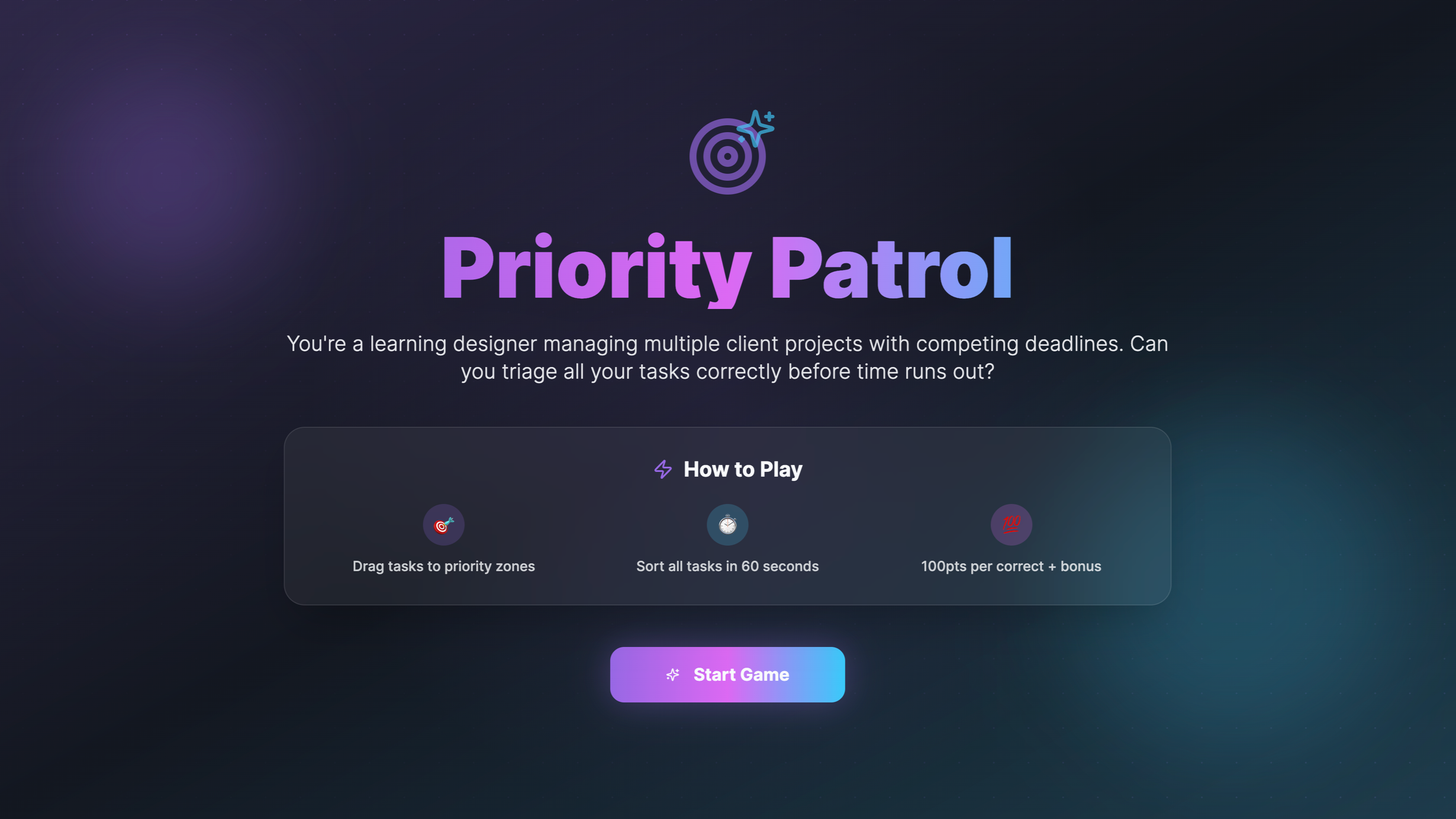
Building Priority Patrol: A Game-Based Approach to Teaching Prioritization Skills
How research-backed game design can transform professional development training.
The Problem
After a decade of designing learning experiences, I've learned this: knowing how to prioritize and actually doing so under pressure are entirely different skills.
Traditional time management workshops (PowerPoint slides on "urgent vs. important" and maybe a handout) don't teach people to make real-time decisions under pressure.
That's why I created Priority Patrol.
What Is Priority Patrol?
Priority Patrol is an HTML5 learning game where players are busy learning, as designers juggle multiple client projects. You've got 60 seconds to drag and drop six tasks into the correct priority zones: High, Medium, or Low.
The mechanics:
Drag-and-drop task cards with realistic workplace scenarios
Countdown timer creates urgency
Immediate feedback showing which decisions were correct and why
Scoring system with points for accuracy and time bonuses
Replay option to practice and improve
The game is built for expansion. I can easily swap in scenarios for different industries or roles. For this version, I focused on nailing the core mechanics.
The Research Behind the Design
Every design decision is grounded in learning science:
Game-Learning Connection: Garris, Ahlers, and Driskell (2002) showed that specific mechanics, such as timers and scoring, create engagement cycles that drive learning.
Immediate Feedback: Van der Kleij et al.'s (2015) meta-analysis proved that immediate, specific feedback significantly improves learning outcomes. That's why Priority Patrol shows exactly which tasks you prioritized correctly with explanations.
Cognitive Load Management: Following Mayer and Moreno's (2003) principles, I created a clean interface with color-coded zones and clear task descriptions. Under time pressure, a confusing design is the last thing learners need.
Motivation Through Gamification: Sailer et al. (2017) showed how game elements satisfy psychological needs. Points provide competence feedback, the timer creates optimal challenge, and replay options support autonomy.
Evaluation Framework: Using Smidt et al.'s (2009) application of the Kirkpatrick Model, the game can be evaluated across four levels: reaction, learning, behavior change, and organizational results.
Evidence-Based: Clark et al.'s (2016) comprehensive review proved that well-designed games improve learning outcomes with moderate to strong effect sizes.
My Design Process
I started with Action Mapping methodology, focusing on what learners need to do differently, not just what they need to know.
The target behavior: Making sound prioritization decisions under time pressure.
Not: Reciting definitions.
From there, I identified realistic scenarios, designed mechanics that mimic real-world pressure, built in constructive feedback, kept the interface clean, and made it replayable.
What's Next?
This version is just the beginning. The architecture allows for:
Industry-specific scenarios
Progressive difficulty levels
Team discussion modes
Analytics dashboards
But most importantly, I wanted to prove a point: behavior-focused learning doesn't have to be boring. When you ground game design in solid research and focus on real-world application, you create training that actually changes how people work.
Want to see it in action? https://prioritypatrolgame.emilygreendesign.com/
Interested in custom game-based learning solutions? Let's chat.
References
Clark, D. B., Tanner-Smith, E. E., & Killingsworth, S. S. (2016). Digital games, design, and learning: A systematic review and meta-analysis. Review of Educational Research, 86(1), 79–122. https://doi.org/10.3102/0034654315582065
Garris, R., Ahlers, R., & Driskell, J. E. (2002). Games, motivation, and learning: A research and practice model. Simulation & Gaming, 33(4), 441–467. https://doi.org/10.1177/1046878102238607
Mayer, R. E., & Moreno, R. (2003). Nine ways to reduce cognitive load in multimedia learning. Educational Psychologist, 38(1), 43–52. https://doi.org/10.1207/S15326985EP3801_6
Sailer, M., Hense, J. U., Mayr, S. K., & Mandl, H. (2017). How gamification motivates: An experimental study of the effects of specific game design elements on psychological need satisfaction. Computers in Human Behavior, 69, 371–380. https://doi.org/10.1016/j.chb.2016.12.033
Smidt, A., Balandin, S., Sigafoos, J., & Reed, V. A. (2009). The Kirkpatrick model: A useful tool for evaluating training outcomes. Journal of Intellectual and Developmental Disability, 34(3), 266–274. https://doi.org/10.1080/13668250903093125
Van der Kleij, F. M., Feskens, R. C., & Eggen, T. J. (2015). Effects of feedback in a computer-based learning environment on students' learning outcomes: A meta-analysis. Review of Educational Research, 85(4), 475–511. https://doi.org/10.3102/0034654314564881
Emily Green is a Learning Experience Designer specializing in behavior-focused training solutions.

Creator's Quest: Gamifying the Content Creator Journey
In an era where digital content creation has become a viable career path, aspiring creators face a unique challenge: developing the multifaceted skills needed to succeed. Creator's Quest, an educational role-playing game, transforms this journey into an engaging, gamified learning experience.
How an Educational RPG Can Transform Content Creation Skills
In an era where digital content creation has become a viable career path, aspiring creators face a unique challenge: developing the multifaceted skills needed to succeed. Creator's Quest, an educational role-playing game, transforms this journey into an engaging, gamified learning experience.
The Science Behind Gamification
Research consistently demonstrates that gamification significantly enhances learning outcomes. A meta-analysis of 41 studies with over 5,071 participants found that gamification produces a large effect size (g = 0.822) on student learning outcomes (Li et al., 2023). A three-year longitudinal study further confirmed that gamified learning improved success rates by 39% and excellence rates by 130% compared to online learning (Lampropoulos & Sidiropoulos, 2024).
These findings are particularly relevant for skills-based learning, such as content creation, where motivation and sustained engagement are critical for mastery.
Why Serious Games Work
Creator's Quest falls into the category of "serious games"—interactive applications designed beyond entertainment to incorporate educational objectives (Oxford Research Encyclopedia of Communication, 2024). These games leverage engaging gameplay to facilitate learning, skill development, and behavioral change across multiple industries.
The power of serious games lies in their ability to provide experiential learning. They combine learning strategies, curricular structures, and game elements to teach specific skills while allowing players to create their own knowledge in safe, consequence-free environments (University XP, 2022).
Creator's Quest: Evidence-Based Game Design
Creator's Quest incorporates several research-backed design principles:
Progressive Skill Development: The game features a comprehensive skill tree spanning technical, teaching, business, and personal development categories. Research shows gamification enhances cognitive, affective, and behavioral learning outcomes by increasing motivation, engagement, and competitiveness (Dehghanzadeh et al., 2024).
Multiple Pathways: Players navigate five key dimensions—authenticity, growth, quality, business, and community—reflecting real-world content creation strategies. This branching narrative ensures player agency matters, a critical element for engagement.
Real-World Trade-offs: Every decision involves meaningful trade-offs. Players balance energy, finances, mental health, and community relationships, mirroring actual creator challenges while supporting situated cognition (De Gloria et al., 2014).
Safe Failure Environment: The game provides a space where failure is educational rather than catastrophic. Players experiment with strategies, learn from mistakes, and iterate toward better outcomes without risking their actual careers (Viteco eLearning, 2024).
Challenges and Future Directions
While research strongly supports gamification's effectiveness, effects depend heavily on implementation context and user characteristics (ResearchGate, 2024). Choosing the right combination of game elements remains challenging, with no one-size-fits-all approach (Smart Learning Environments, 2023). Creator's Quest addresses this through multiple gameplay modes allowing players to focus on aspects most relevant to their goals.
As the content creation economy expands, tools like Creator's Quest represent an evolution in professional education. Rather than learning through expensive trial and error, aspiring creators can develop skills, test strategies, and build confidence in structured environments. The game serves not as a replacement for actual experience, but as a complementary tool accelerating learning and informing real-world decisions.
Conclusion
Creator's Quest demonstrates how serious games can address educational needs in the modern creator economy. By combining evidence-based gamification principles with realistic scenarios and meaningful choices, it offers an engaging and effective approach to skills development. As research continues validating gamification's power in education, games like Creator's Quest represent not just a novel way to learn—but potentially a more effective one.
References
Dehghanzadeh, H., Farrokhnia, M., Dehghanzadeh, H., Taghipour, K., & Noroozi, O. (2024). Using gamification to support learning in K-12 education: A systematic literature review. British Journal of Educational Technology, 55(1), 34-70. https://doi.org/10.1111/bjet.13335
De Gloria, A., Bellotti, F., & Berta, R. (2014). Serious games for education and training. International Journal of Serious Games, 1(1). https://doi.org/10.17083/ijsg.v1i1.11
Lampropoulos, G., & Sidiropoulos, A. (2024). Impact of gamification on students' learning outcomes and academic performance: A longitudinal study comparing online, traditional, and gamified learning. Education Sciences, 14(4), Article 367. https://doi.org/10.3390/educsci14040367
Li, M., Ma, S., & Shi, Y. (2023). Examining the effectiveness of gamification as a tool promoting teaching and learning in educational settings: A meta-analysis. Frontiers in Psychology, 14, Article 1253549. https://doi.org/10.3389/fpsyg.2023.1253549
Oxford Research Encyclopedia of Communication. (2024). Serious games. https://doi.org/10.1093/acrefore/9780190228613.001.0001/acrefore-9780190228613-e-1482
ResearchGate. (2024). Exploring the benefits and challenges of gamification in enhancing student learning outcomes. https://doi.org/10.13140/RG.2.2.18493.44009
Smart Learning Environments. (2023). Gamification of e-learning in higher education: A systematic literature review. Smart Learning Environments, 10, Article 10. https://doi.org/10.1186/s40561-023-00227-z
University XP. (2022). Playing serious games. https://www.universityxp.com/blog/2021/9/28/playing-serious-games
Viteco eLearning. (2024). Serious game: Definition, benefits, methods, and tools. https://www.vitecoelearning.eu/en/serious-game-videogames-education-gamification/

El Conejo's Cultura: Building a Bad Bunny Game (The Tech, The Culture, The Journey)
As a Bad Bunny fan and developer, I wanted to create something that celebrated El Conejo Malo's cultural impact while experimenting with interactive web experiences. The result? El Conejo's Cultura Juego: a drag-and-drop game that's equal parts tribute and technical challenge.
As a Bad Bunny fan and developer, I wanted to create something that celebrated El Conejo Malo's cultural impact while experimenting with interactive web experiences. The result? El Conejo's Cultura Juego — a drag-and-drop game that's equal parts tribute and technical challenge.
The Inspiration
Bad Bunny isn't just a reggaeton artist; he's a cultural phenomenon who's reshaped Latin music, fashion, and representation. I wanted to capture that energy in an interactive format that felt playful and engaging; something fans could enjoy while learning more about his impact.
The Technical Build
I built the game vibe coding — using html, css, and JavaScript with drag-and-drop functionality at its core. The challenge was making the interactions smooth and intuitive across different devices while keeping the design vibrant and true to Bad Bunny's aesthetic.
Key technical decisions included:
Responsive drag-and-drop mechanics that work on both desktop and mobile
Colorful, bold UI inspired by Bad Bunny's visual style
Fast loading times to keep players engaged from the first interaction
The Learning Process: Why Failure Isn't an Option
One unique aspect of El Conejo's Cultura is its approach to mistakes—there aren't any. If you don't quite nail the gesture or miss a move, the game doesn't penalize you with a "game over" screen or force you to restart. Instead, it adapts and lets you try again.
Why this matters:
This design choice is intentional and rooted in cultural learning principles. Traditional art forms like puppetry aren't learned through rigid pass-fail systems—they're learned through practice, repetition, and gradual mastery. Master puppeteers don't scold apprentices for imperfect movements; they guide them toward improvement.
By removing failure states, the game creates a low-pressure learning environment where players can:
Focus on the cultural experience rather than performance anxiety
Experiment with gestures without fear of punishment
Develop an intuitive understanding of the puppet's movements through repetition
Stay immersed in the narrative without jarring interruptions
The technical side:
The game uses adaptive difficulty adjustment. If you're struggling with a particular gesture or timing, the system subtly loosens its requirements or provides additional visual cues. This keeps frustration low and engagement high—essential for maintaining the emotional connection that makes cultural learning effective.
Research supports this approach: studies show that cultural digital games with lower performance pressure and adaptive support systems enhance both emotional engagement and cultural understanding compared to rigid, punitive systems. The goal isn't to test you—it's to invite you into Bad Bunny's world and let you experience the art form at your own pace.
This forgiving design philosophy reflects a core value: cultural appreciation shouldn't feel like an exam. It should feel like play, exploration, and discovery—which is exactly what makes El Conejo's Cultura work.
The Creative Process
Designing around Bad Bunny's brand meant embracing maximalism: bright colors, bold typography, and an unapologetically fun vibe. Every element needed to feel like it belonged in Benito's world, from the color palette to the playful language.
What I Learned
Building El Conejo's Cultura taught me that the best projects combine passion with purpose. When you're creating something you genuinely care about, the technical challenges become puzzles to solve rather than obstacles.
Play the game above or here.

Quick Tips: Advanced Audition Editing
Whether you're cleaning up podcast recordings, interview audio, voice-overs, or field recordings, this quick-hit tutorial provides practical workflows that deliver professional-sounding results without overwhelming you with information.
Background noise, reverb, and unwanted audio artifacts can ruin an otherwise perfect recording, but Adobe Audition offers a powerful suite of tools to rescue your audio. In my comprehensive tutorial video, I break down essential audio cleanup techniques, each explained in under 60 seconds.
You'll learn how to use the Denoise feature by capturing a clean noise print from silent sections of your audio, then applying precise reduction across your entire track. I also demonstrate the Spot Healing Brush for quickly removing clicks, pops, and other isolated imperfections with surgical precision. For recordings plagued by excessive room echo, I walk through the De-Reverb tool to restore clarity and presence. Additionally, I address noise reduction processing for complex audio scenarios that involve multiple types of unwanted sounds requiring careful attention.
Whether you're cleaning up podcast recordings, interview audio, voice-overs, or field recordings, this quick-hit tutorial provides practical workflows that deliver professional-sounding results without overwhelming you with information.
Watch the full video to see each technique in action and transform your noisy recordings into polished, broadcast-ready audio in minutes.

Addressing Fictional Challenges Through Real Instructional Design Solutions
As museums navigate the digital revolution to meet modern visitor expectations, the need for comprehensive staff training becomes paramount.
For this Full Sail University Instructional Design and Technology project, creating a training video that addresses visitor engagement challenges at a fictional museum provides an excellent opportunity to demonstrate core learning design principles in action. With museums seeing more than 850 million visitors per year in the US alone, technology has become critical in enhancing the visitor experience, making this a relevant and timely instructional challenge. The fictional scenario allows for creative problem-solving while applying evidence-based training methodologies to a realistic workplace situation. Video guides are particularly effective for instruction because they're visually clear and can demonstrate correct procedures and sequences, with 83% of people preferring to receive instructional content by video rather than text or image form. This project demonstrates how instructional designers can create compelling learning experiences that bridge the gap between theoretical knowledge and practical application, using QR code implementation as a vehicle to showcase multimedia instruction, performance support, and change management principles.
Showcasing Instructional Design Expertise Through Museum Technology Training
This Full Sail project presents an ideal canvas for demonstrating advanced instructional design competencies, from needs analysis through evaluation and implementation support. The fictional museum staff training video must incorporate key learning design elements while addressing realistic workplace challenges. The instructional content should cover how frontline staff can help visitors navigate QR code-enabled experiences, including troubleshooting technical issues and explaining the value of engaging with QR-linked content, demonstrating how effective workplace learning addresses both technical skills and soft skills development. The project can showcase how strategic instructional design can lead to measurable outcomes—proper QR code implementation can increase mobile guide conversion rates from 5% to 35%—while emphasizing learner-centered design principles. The training approach should model best practices by emphasizing that quality over quantity is key when curating content, focusing on delivering bite-sized, engaging, and high-quality instruction that aligns with clear learning objectives. By creating a comprehensive training solution for this fictional scenario, the project demonstrates mastery of instructional design theory, multimedia development skills, and the ability to create meaningful learning experiences that drive real organizational change.
Filmmaking for LXD
This video was created for my Full Sail University Master of Science in Instructional Design and Technology, specifically for the Filmmaking Principles in Instructional Design course.
In this tutorial, I'll be demonstrating essential watercolor pencil techniques that can enhance your visual storytelling and design work as filmmakers. This video was created for my Full Sail University Master of Science in Instructional Design and Technology, specifically for the Filmmaking Principles in Instructional Design course. We'll cover the fundamentals of how these versatile tools work, from dry application to water activation, and explore how to achieve different textures and effects that are particularly useful for concept art, storyboarding, and pre-production visualization. By the end of this video, you'll have a solid foundation in watercolor pencil basics that you can apply to your own film projects.

Behind the Scenes: Building an Engaging e-Learning Module with Adobe Captivate
Discover how interactive elements and thoughtful navigation come together in this Adobe Captivate project created during my Master's in Instructional Design and Technology course.
In this video, I walk through a demo of my Adobe Captivate project, "Your Pickleball Primer." This project was part of my Master of Science in Instructional Design and Technology degree program at Full Sail University, specifically for my Visual and Verbal Communication in Instructional Design course. I'll be highlighting the interactive elements I incorporated, the navigation I designed, and how I leveraged different features within Captivate to create an engaging learning experience. This demo offers insights into my practical application of e-learning design principles.

Learning Through Authentic Example: The Power of Personal Model Training
“It feels more like learning alongside each other rather than being lectured to, and that collaborative spirit seems to stick with people long after the training ends. ”
Above is my Rise interaction featuring the content I created for a recent project for my Corporate Training and Motivational Development course at Full Sail University.

During my master's program in Instructional Design and Technology at Full Sail University, I had the opportunity to develop and deliver training presentations that applied theory to practice. Through this experience, I discovered that the most effective way to connect with adult learners isn't through polished presentations or theoretical frameworks—it's by getting real about how I work. When I train manufacturing workers on new robotic interfaces or other technical skills, I don't position myself as the distant expert with all the answers. Instead, I share my genuine experience: the successful approaches I've developed, the mistakes I've made along the way, and the messy reality of learning something new. I walk participants through my actual thinking process out loud, showing them not just what to do, but how I figure out what to do when I'm uncertain.
This authentic approach creates something powerful in the training room. Participants become more engaged because they can see that professional expertise isn't about perfection—it's about having thoughtful processes and learning from experience. When someone asks a question, I don't just give them the textbook answer; I show them how I would actually approach that same problem in real life, complete with my reasoning and even my uncertainties. It feels more like learning alongside each other rather than being lectured to, and that collaborative spirit seems to stick with people long after the training ends. The result is learners who feel empowered to tackle challenges with confidence, knowing that stumbling and figuring things out is part of the process, not a sign of failure.

Learning Engagement Strategies
Transforming Learning: My Three-Week Journey
My three-week deep dive into "Strategies for Learner Engagement" transformed my home office into an experimental learning lab and revolutionized my approach to instructional design, progressing from exploring engagement-amplifying technologies like VR headsets and quality audio equipment in Week 1, to understanding the science behind sticky learning through theoretical frameworks like self-determination theory and project-based learning in Week 2, and finally embracing AI innovations that create personalized learning experiences in Week 3. This journey revealed that effective engagement isn't accidental but architecturally designed, and that AI doesn't replace human connection but amplifies it—ultimately equipping me with a richer toolkit to create learning experiences that don't just inform but truly inspire and transform.

Mastery Journal
Visit my final interactive project for my Mastery class at Full Sail University.
This is a mastery jounral for my final MS IDT winter semester project at Full Sail University.

Select the button
Select the button to interact with the module.

The Trust20 Food Handler UX and Visual Design update is now live!
I redesigned Trust20’s Food Handler layout to enhance accessibility and improve the overall learning experience.
I collaborated with Trust20 to revamp their extensively used course, Food Handler. The redesign aimed to enhance accessibility and improve the overall learning experience. Key changes include a more user-friendly interface, updated interactions and knowledge checks, improved accessibility features, and the inclusion of learning outcomes for each module.

Snapshot from the latest Trust20 Newsletter, The Shift.

Trust20 Food Show Course Demos Debut
A great way to showcase your products at trade shows is through interactions customized for the conference environment.
I recently created functional demos of several Trust20 content pieces for interactive use during the upcoming Food Show season. Check out their Instagram post featuring their new booth and my demos!

Reverse Hot Spots in Rise
If nothing else, making simple tweaks like these makes developing with Rise as the tool of choice more enjoyable when a client requests it.
If you use Articulate Rise to develop content, you know that even though there are many ways to customize the authoring tool, it certainly has its limitations. I often use Java or light HTML to customize aspects of my files for clients. Here’s an example I really love: the “Reverse Hot Spot.”
I have learned a lot from Mighty Design’s tutorials and purchased a block from their customization packages. However, you can learn how to integrate customizations into the CSS of the Rise file and even change the "START COURSE" button in the published output with some simple code for free.
If nothing else, making simple tweaks like these makes developing with Rise as the tool of choice more enjoyable when a client requests it.

Photoshop Animations
Did you know you could use Photoshop to create animations?
Did you know you can use Photoshop to make animations for your next project?
I normally use Photoshop to edit images for my projects; however, this week, I learned that you can use the tool to create some decent animations.
My project this week at RISD involved using Photoshop to edit and animate three distinct files, including scale, rotation, and variations in hue, saturation, and brightness. Check out my work below.
“Put Your Best Foot Forward” " was featured on RISD’s Instagram page this week.


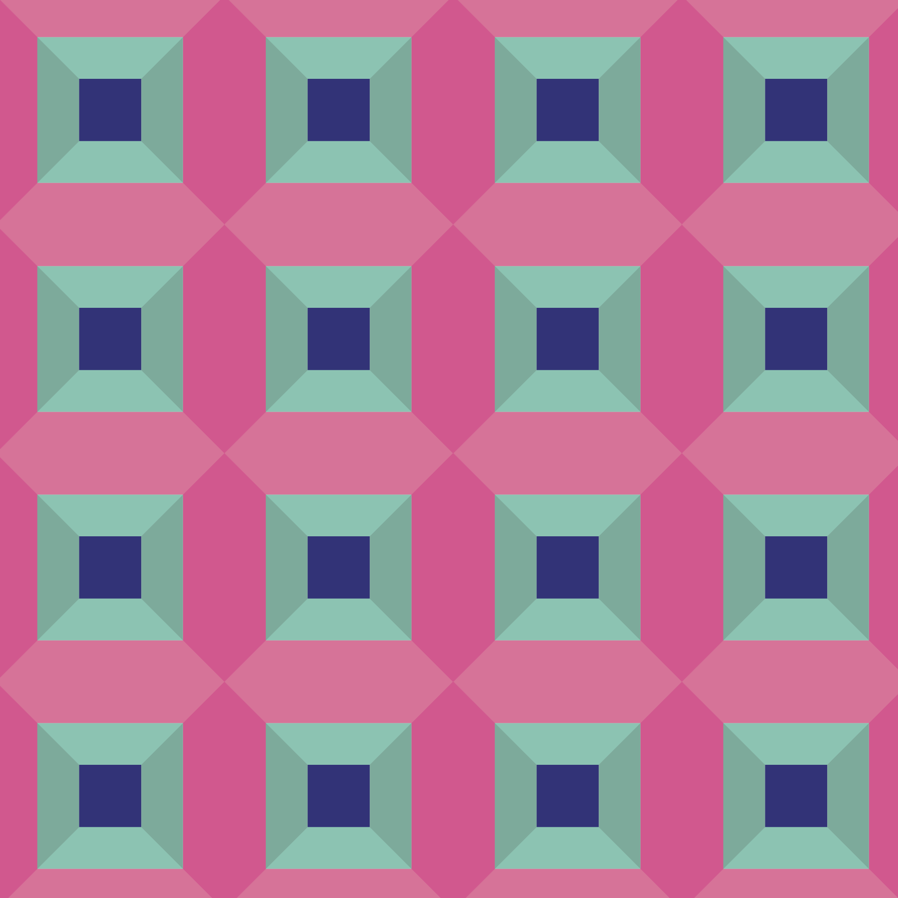
I See a Pattern
Recap of Spring Semester Part A at RISD and patterns created in Adobe Illustrator.
The Spring Semester Part A at RISD is about to end, and I am excited to share some of my patterns that I developed during the Digital Design Fundamentals course. Over the six-week session, we used PhotoShop, Illustrator, and InDesign to create our designs. In the upcoming Spring Semester Part B, we will explore different mediums used to create digital artwork.


Each pattern was created in Adobe Illustrator.
Behold, the Bezold
The Bezold effect occurs when the hue of a color is altered in appearance by the presence of surrounding colors.
As I finish up my winter semester at RISD, I wanted to share some recent pattern designs I've created for larger projects as well as personal ones.
By far, my favorite design is one that demonstrates the Bezold effect.
What is the Bezold effect you ask?
Described by its namesake, Wilhelm von Bezold, the Bezold effect occurs when the hue of a color is altered in appearance by the presence of surrounding colors.

My Bezold designs created in Adobe Illustrator for RISD.


At first glance, one might assume these two designs employ different patterns. However, the two patterns employ identical color palettes and harmonies, the only difference being the application. This illusion inspired me to create a few other patterns in my free time to share with friends and Instagram for use in social wallpapers.
Enjoy a couple below.


Procreate Dreams
Procreate and Procreate Dreams: The powerful illustrator seamlessly integrates into a robust animation tool right from my iPad.
I have been illustrating in Procreate for years, often turning my work into small animations to bring specific designs to life.
In November 2023, Procreate introduced Procreate Dreams, a robust animation tool that seamlessly integrates with Procreate Illustrator.
I have been experimenting with this new app, and with some practice and tips, anyone can learn the necessary skills to approach animation in Procreate Dreams.
Exporting Procreate layers to Dreams tracks is now easier thanks to familiarity with Adobe After Effects and Premiere Pro. You can create your desired animations using keyframes, performance modes, and frame-by-frame animation.
Take a look at my illustration and the Dreams animation I made using it below.

I combined layers in Procreate to prep for the integration into Dreams.