
The People's Professors: How I Built a Course About TikTok Teaching Strategies
My capstone project journey, mistakes and all
Where This Started
I kept noticing something weird.
I'd scroll through TikTok and actually learn things. A woodworker would teach me about grain direction in 45 seconds. A makeup artist would explain color theory as she did her morning routine. A language teacher would have me repeating Spanish phrases before I realized I was being taught.
Then I'd go to work and sit through a 45-minute compliance module where I clicked "Next" seventeen times without absorbing a single thing.
Something didn't add up.
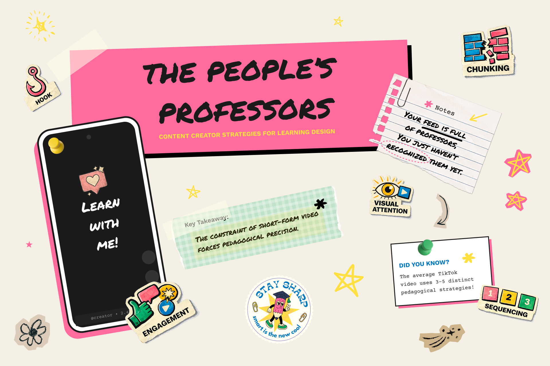
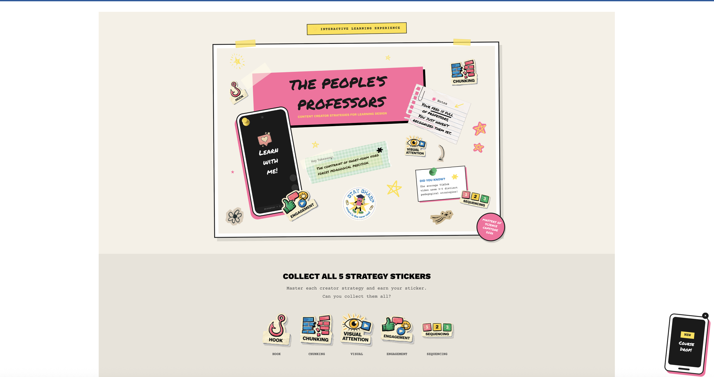
That frustration turned into my capstone project: The People's Professors: How Content Creators Democratize Education Through Short-Form Video. It's an interactive learning experience that teaches instructional designers to apply five creator strategies (Hook, Chunking, Visual Attention, Engagement, and Sequencing) to workplace nano-learning.
The thesis I kept coming back to: the algorithm has become the new syllabus. Creators learn what works through views, likes, and watch time. The strategies that survive the scroll? They're backed by the same learning science that took educational psychologists decades to figure out. Creators just got there through trial and error, not textbooks.
The course's central thesis
The Problem I Wanted to Solve
Here's what I've seen over and over in my career: learners hate traditional eLearning. Designers create these long modules, learners click through to check a compliance box, and nobody actually remembers anything a week later.
There's this huge gap between how people naturally consume information now (short, visual, engaging) and how most organizations deliver training (long, dense, text-heavy).
But TikTok? People are genuinely learning there. Researchers Khlaif and Salha actually studied this back in 2021. They found that the 60-second constraint forces clarity. One concept, one takeaway, maximum retention.
I wanted to bridge that gap. Take what creators do instinctively and make it teachable for learning designers like me.
Finding the Right Look (After Getting It Wrong)
I'll be honest: my first visual direction was completely off.
I almost went with this fantasy theme. "Kingdom of Engagement." "Pedagogical Artifacts." It felt clever at the time. But something was bugging me about it, and I couldn't figure out what.
Then I landed on the zine aesthetic, and everything clicked.
Think about it. Zines were the original democratization of publishing. Before the internet, anyone with a photocopier could become a publisher and bypass traditional gatekeepers. That's exactly what content creators are doing now. They're democratizing education by bypassing traditional academia.
Zines Creator-Educators Photocopier access Smartphone + platform Bypassed publishers Bypassed universities Raw over polished Authentic over produced Community distributed Algorithm distributed
The DIY scrapbook look isn't just for aesthetics. It is the argument, visually. The medium reinforces the message: education doesn't need to be slick and institutional to be effective.
Rules I Set for Myself
I came up with some principles to keep the "messy" look purposeful:
Democratic over polished. It should feel accessible, not exclusive.
Energetic over static. Rotation and visual "noise" create movement.
Mixed over uniform. It should feel assembled, not templated.
Readable over decorative. Accessibility always wins.
Meaningful over random. Every element should serve communication.
That last one saved me more than once. I got feedback on an early design that it looked "messy," and they were right. I had added decoration without purpose. The fix wasn't to abandon the zine vibe. It was to be more selective. A yellow highlight here, a pink shadow there, one tilted stamp. Controlled chaos instead of just chaos.
Learning to Code
I'm not a developer. I don't have a CS degree. But this project needed custom HTML, CSS, and JavaScript to work in Articulate Rise, so I figured it out as I went.
I call it "vibe coding." Work iteratively. Use browser developer tools to inspect and fix things. Build through trial and error. Google a lot. Ask for help when stuck.
What I Used
Articulate Rise for the base platform
Mighty Plugin for CSS and JavaScript injection
GitHub for version control (this became essential)
SCORM Cloud for deployment and testing
Browser DevTools constantly, for everything
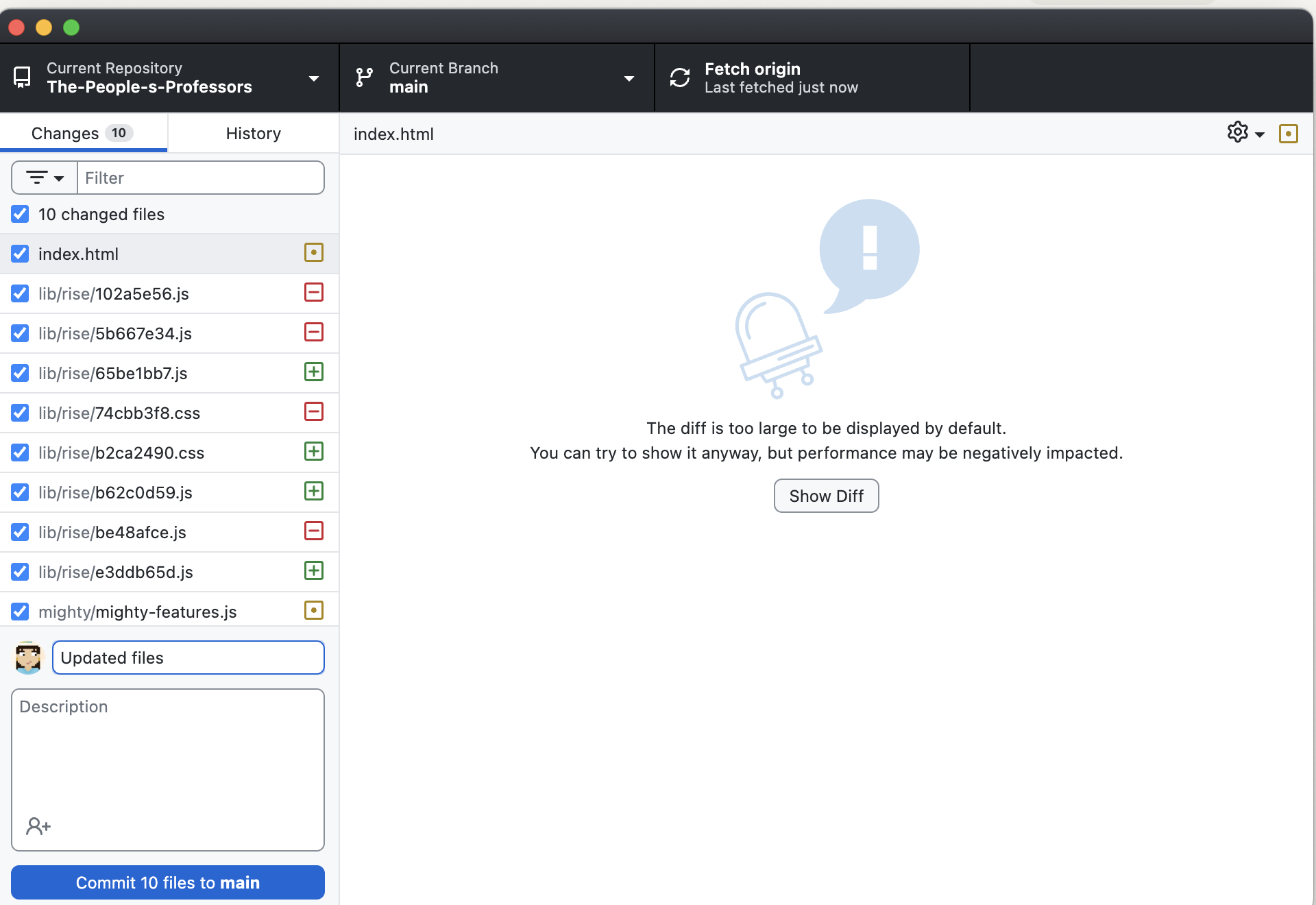
Version control became essential as the codebase grew
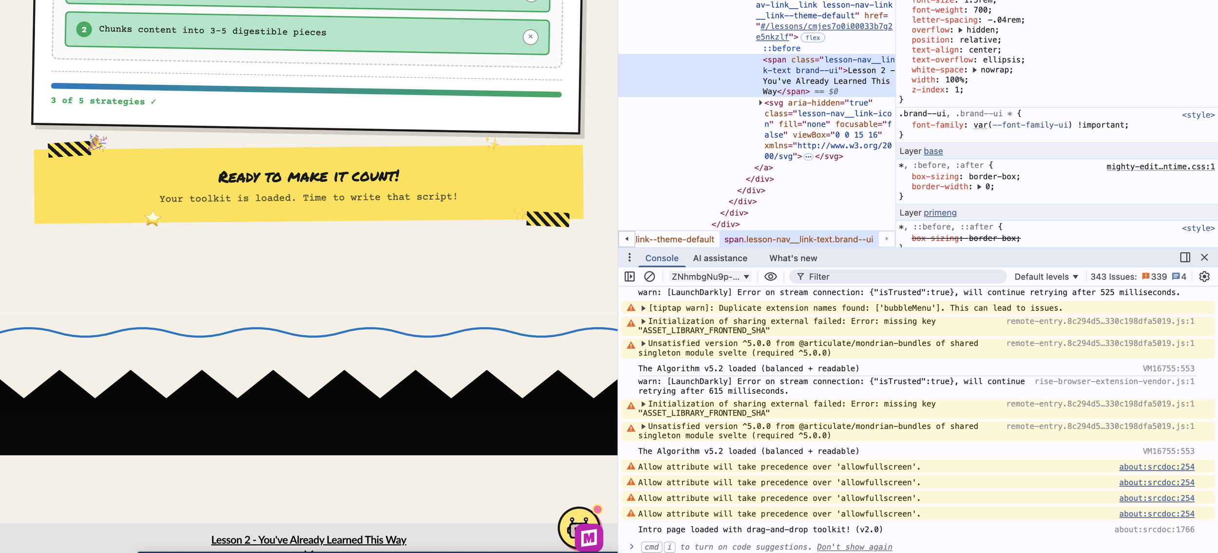
Debugging CSS hover states in the browser
The Custom Stuff I Built
Rise is great out of the box, but it doesn't have everything I need. So I built it.
The Sticker Collection System
Learners earn stickers by passing quizzes, one for each of the five strategies. A floating sticker book tab shows their progress, and watching those stickers fill in feels genuinely rewarding.
This was harder than I expected. The sticker book needed to only appear in certain lessons, remember what learners had earned across page loads, lock rewards behind quiz completion, and celebrate when someone finished their collection.
I went through so many versions. We're on v20 of the storage key at this point. Lots of edge cases to work through, like what happens when someone navigates away mid-quiz or refreshes the page.
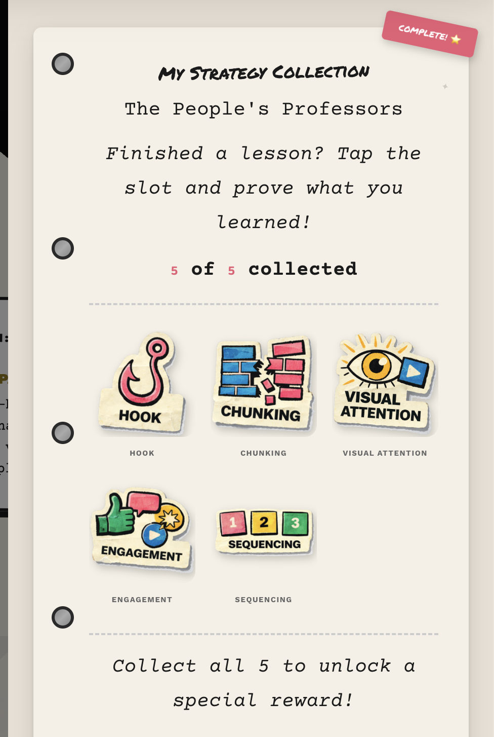
The sticker book with quiz-gated rewards
"The Algorithm" Chatbot
This is a little helper that follows learners through the course. Ask it, "What's a hook?" and it explains. Say "I'm stuck," and it offers encouragement. It even knows which lesson you're on and changes its greeting.
I styled it to match the zine look. Torn paper edges, tape decorations, typewriter fonts. But it's also packed with content about all five strategies and the learning science behind them.
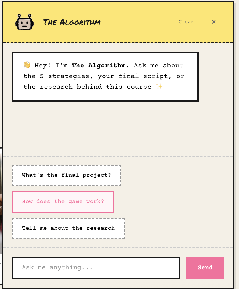
"The Algorithm" provides just-in-time support
The Script Template with Automated Feedback
This is where the learning gets real. Learners write their own 60-second video script, and the tool gives them instant feedback based on all five strategies. It scores each one on a 1-4 scale with specific suggestions for improvement. Not just "you got this wrong" but "here's how to make it better."
They can download their script as a PDF with their scores, so it becomes a portfolio piece.
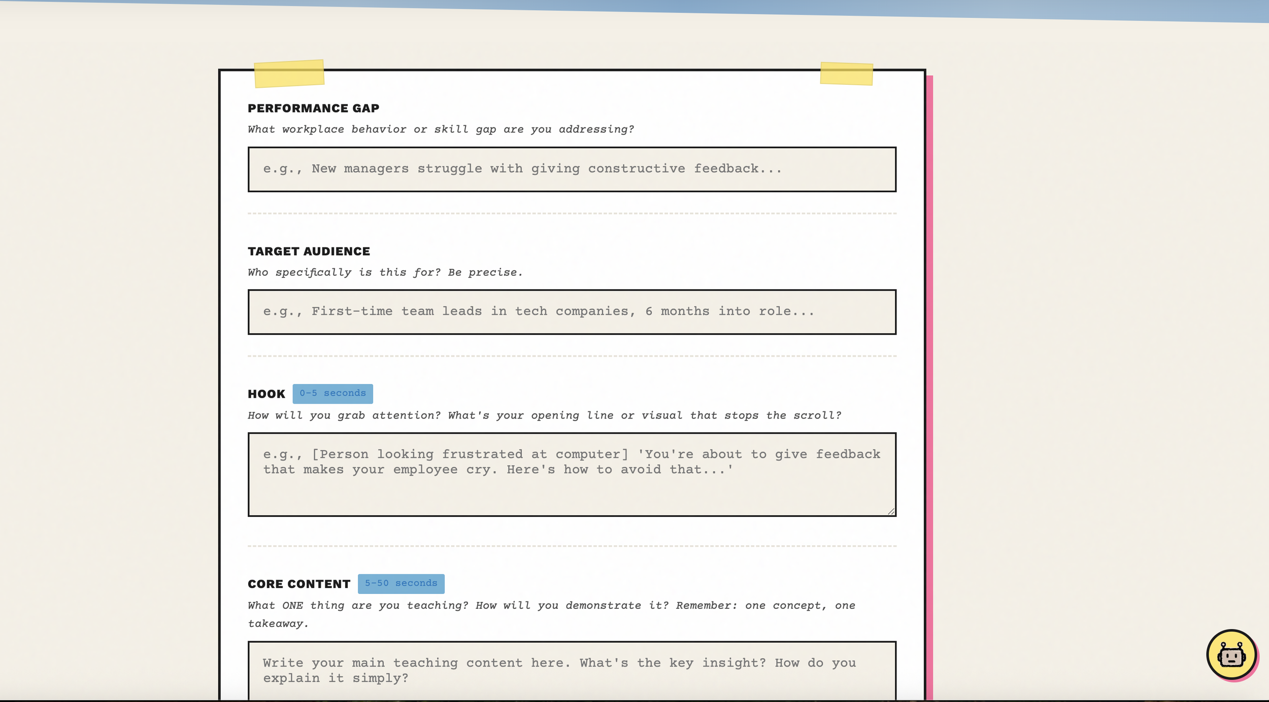
The script template with automated rubric feedback
Custom Visual Dividers
Rise's default dividers are fine but generic. I created torn paper edges, washi tape strips, and paper clips with risograph paper. Little things that maintain the zine personality between content sections.
Custom dividers keep the handmade feel
How the Lessons Work
Every strategy follows the same structure, based on Merrill's First Principles of Instruction:
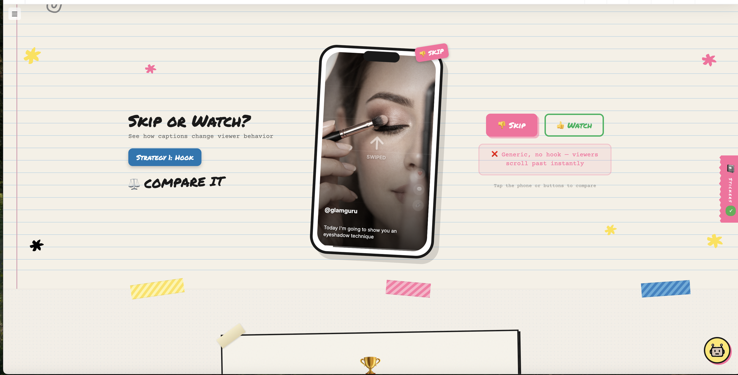
SEE IT - Watch real TikTok creators using the strategy
COMPARE IT - Look at side-by-side examples, effective vs. ineffective
PROVE IT - Pass a quiz to earn your sticker
This keeps things consistent while letting each strategy feature different creators. Makeup artists, woodworkers, language teachers, guitarists. The techniques work across all kinds of content.
And the research isn't just name-dropping:
Mayer's Multimedia Principles shaped the Visual Attention lesson
Merrill's First Principles structured the entire course flow
Vygotsky's scaffolding informed Sequencing
Jenkins' participatory culture grounded Engagement
Khlaif and Salha's TikTok research validated the whole nano-learning approach
Things That Went Wrong (And How I Fixed Them)
The Single-Page App Problem
Rise doesn't do full page reloads between lessons. It's a single-page application. So my sticker book kept showing up everywhere after someone visited the target lesson, because the elements just stayed in the page.
The fix: I had to add continuous monitoring (checking every 500 milliseconds) to see what lesson the learner was on and hide or show the sticker book accordingly. Not elegant, but it works.
The "Too Messy" Feedback
My first showcase PDF came back with feedback that it looked messy. I had to step back and realize I was breaking my own rules. I had added tape, torn edges, and decorations everywhere without thinking about whether they served a purpose.
The cleaner version kept the zine energy through just a few key elements. It ended up looking like a well-designed conference poster that hints at being handmade, rather than overwhelming people with visual noise.
The CSS Variable Discovery
I spent way too long trying to override Rise's hover states with regular CSS and nothing was working. The breakthrough came when I dug into DevTools and discovered Rise uses CSS custom properties internally. I needed to override the variables (like --button-background-hover-color) instead of fighting individual style rules.
Finding Rise's CSS variables was the breakthrough
Misaligned Requirements
My original checklist required learners to use all five strategies in their final script. But the actual learning outcome only said "at least three." That's a problem! Not every video needs all five strategies, and forcing them could feel unnatural.
I had to realign everything so the deliverable matched what I was actually asking learners to do.
What I Ended Up With
The finished course includes:
5 strategy lessons following the SEE IT, COMPARE IT, PROVE IT structure
A gamified sticker collection with quiz gates
"The Algorithm" chatbot for help along the way
A 60-second script template with automated rubric feedback
Custom visual design throughout
A downloadable toolkit for continued use
A feedback survey for evaluation
It's live on SCORM Cloud and part of my professional portfolio at emilygreendesign.com.
What I Took Away From This
On the Technical Side
You don't need a CS degree to build custom learning experiences. Vibe coding is real.
Browser DevTools are your best friend when you're figuring things out.
Version control (GitHub) stops being optional once you have more than a couple files.
Single-page apps require different thinking than regular websites.
On Design
Every visual choice should communicate something, not just decorate.
Constraints (like 60 seconds) force clarity and creativity.
An aesthetic can literally be your argument when it connects to your content.
"Readable over decorative" is worth remembering every single time.
On Instructional Design
Content creators are doing sophisticated teaching work without realizing it.
The gap between casual learning and formal training is worth bridging.
Gamification works when it's meaningful, not when it's tacked on.
Good feedback tells people how to improve, not just whether they're right or wrong.
Try It
The course is live. Scan the QR code below to experience The People's Professors and start applying creator strategies to your own work.

Scan to access the course
Thank You
This was my IDT680 capstone at Full Sail University. Thanks to Dr. Reo and my classmates for the feedback throughout, and to all the content creators out there whose work made me think differently about what teaching can look like.
The algorithm really has become the new syllabus. And I learned a lot from it.
Emily Green is an instructional designer and learning experience designer.