
UX in the Wild

Procreate Postcards
Procreate is the hardest-working app for digital art, and Lisa Bardot is the professor you need to master the tool.
As a permanent student and avid fan of Lisa Bardot's Art maker's Club, I have learned a lot from her. Lisa is a renowned Skillshare teacher, Procreate brush creator, and an all-around superstar who is about to release a book. Recently, I took her vintage postcard class and applied some techniques, styles, and color palettes that were inspired by the animators who worked on Ludo's "Bluey."
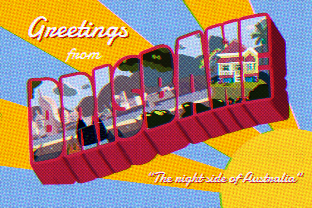
Bluey and family live in Brisbane, Australia, on the right side of the continent.
I spent approximately six weeks, intermittently, creating the drawing inside the letters. I completed the effects and background over Labor Day weekend. Even though I don't have any immediate plans to travel to Australia, I know where my first destination will be when I eventually go.
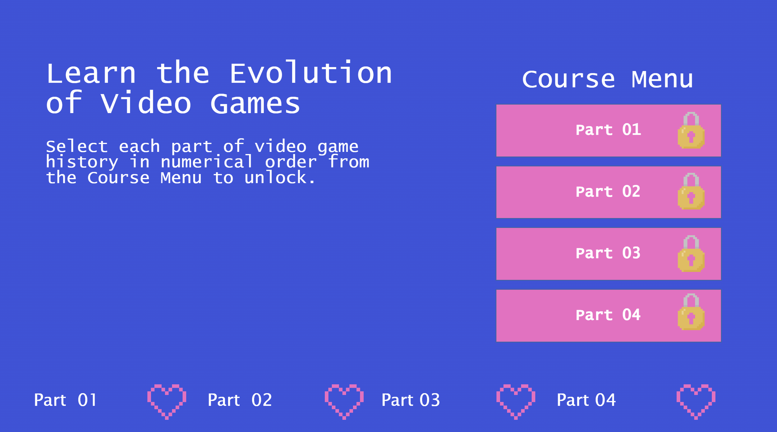
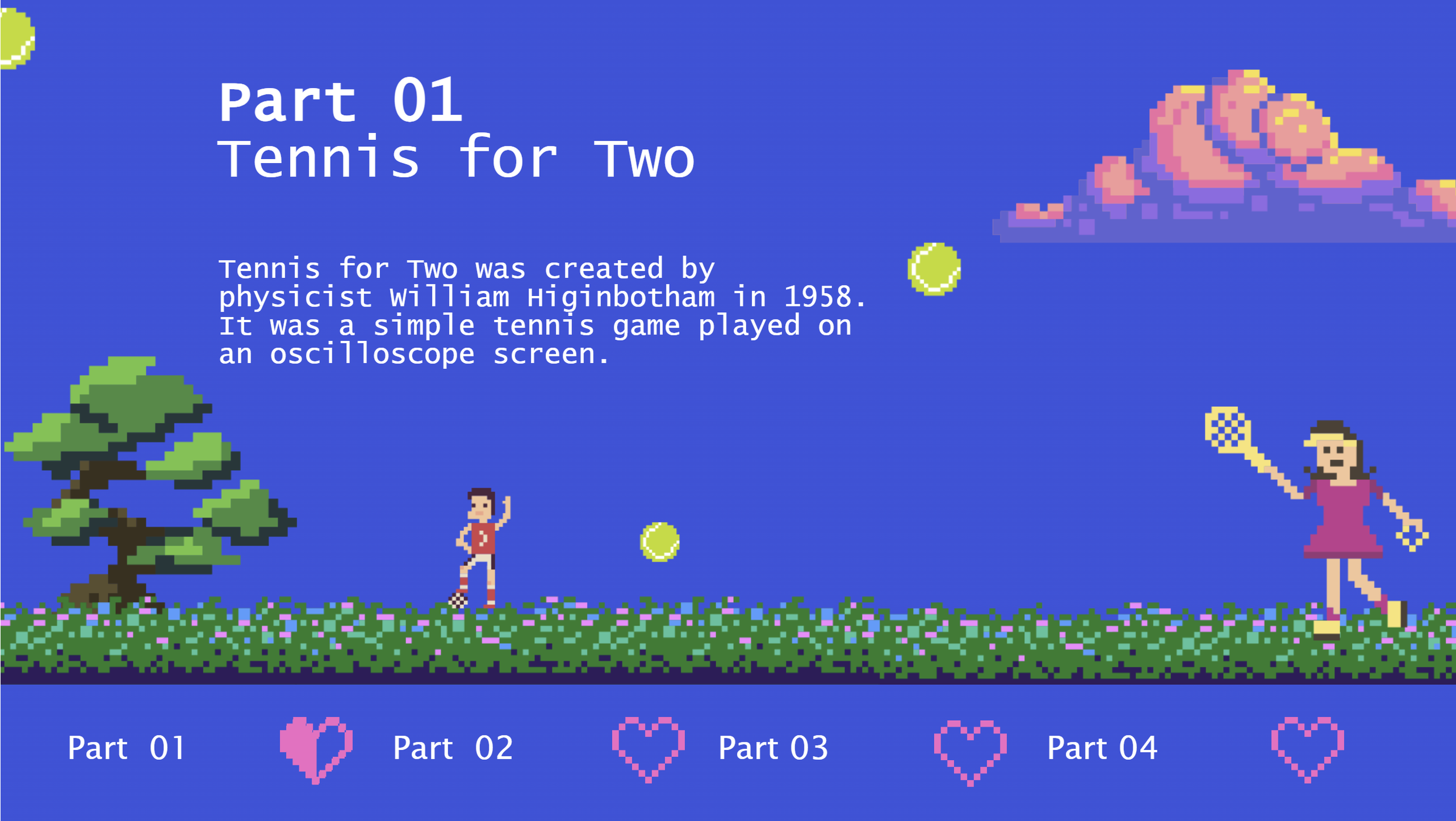
True/False Variables Make Tracking Progress Truly Fun!
True/False Variables Make Learning Truly Fun!
I recently attended a webinar on using progress meters in e-learning courses. The speaker, David Anderson, demonstrated using number variables and custom states to display learner progress visually. Inspired, I created my own True/False variable micro-course on the "History of Video Games."
Select or tap the gif above to learn more.
This course features:
Course Menu button state changes
Progress meter adjusted with T/F variables and state triggers
Pixel graphics
Arcade music

What was your first video game experience?
Let me know in the comments.

Barbie’s iconic font
Dive into the history of the iconic Barbie font, “Dolly.”
Barbie is more than just a toy - it's a widely recognized brand with its bright colors, playful themes, and iconic fashion. Today, with the release of the latest movie in theaters, it's worth taking a moment to reflect on the history of the brand's typography. I mean, have you seen the marketing? It is genius.

Let’s Dive In!
We’ll take a look into the Dolly font’s evolution and see how it’s transformed over time.
This is my take on the Barbie Dream Pool, btw.
The “Modern Dolly” Barbie script font came from the brand’s early years, as Barbie's logo underwent several iterations. The original logos used a simple, thin, and elegant script font. This font had a more subdued and less stylized appearance than the iconic font that most people associate with Barbie today.

The “Retro Dolly” font (primarily used in the new movie marketing) was introduced in the early 1980s. This script font features a playful and whimsical design with elongated strokes, curvy letters, and a slightly slanted angle. It exuded a sense of femininity and glamour, aligning perfectly with Barbie's image as a fashion-forward and stylish doll.
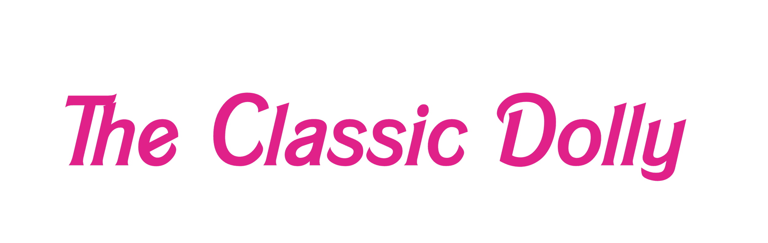
The “Classic Dolly” Barbie font is primarily used for the logo but has also been adapted for other branding elements, such as packaging, advertising materials, and promotional products.
I happen to love all versions of this font, what about you? Let me know in the comments below.

Mental Health Awareness Month ELH#410
Sentient Sentiments: Articulate eLearning Heroes Challenge #410
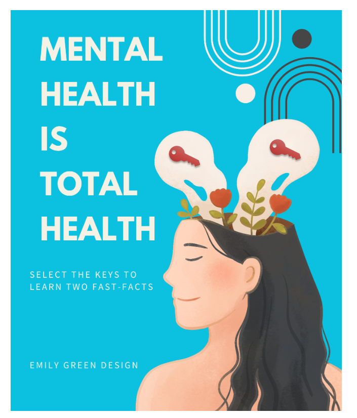
My entry into Articulate’s eLearning Hero Challenge #410: MENTAL HEALTH IS TOTAL HEALTH.
The challenge was to use video, AI, and the Articulate authoring platform to teach or inform a topic.
Tools used: Synthesia for AI, Adobe for graphics and music, and Articulate for interaction/player.


9-Stress Busters
Meet stress where it’s at with this stress-busting tool.
I’ve been using the Lyra mental health platform for therapy over the last month, and it has inspired me not only to meet stress where it is at but also to design tools that help me address stress when it manifests.
I’m sharing my latest design and resource below. I hope it brings you relief wherever you are.

Select the image to learn 9 Stress Busters.

3-Minute Micro
Melt Away Stress with My New 3-Minute Micro Exercise
Time, or not having enough of it, is a stressor in and of itself. I have some relief to offer in my new 3-Minute Micro Breathing Exercise.
Select the GIF below to start melting stress away.

Take it with you anywhere!

Hi-Fi with AI
Learn how I leverage automated intelligence when creating design projects on time and within budget.
Artificial Intelligence (AI) is a big topic as of late. Bing, Chat GPT, Synthesia, M3GAN. But rather than be intimidated by it as a human and as a developer/designer, I decided to embrace and leverage it with a recent project.
Check out the ways I designed a hi-fi product using AI.

Free Download: Responsive Scenario in Storyline
Free Storyline download of Articulate Rise-stylized scenario for customization.
Learning experience designers and developers: have you wished the cool Rise features and blocks would integrate into Storyline as Storyline does within Rise?
I know I have. So I took things into my own hands.
One of those features is the branched scenarios, as I like the simplicity of the design and style. For a recent client, I built a Storyline scenario that follows the Rise Style; check out in action here.
I’ve heard from others in the Articulate Hero community that the source file was a great help to their projects, so I dropped the .STORY download in the post below for your customization.

TRON Facts About the GRID
Enter the grid with my custom TRON accordion interaction for Articulate’s eLearning Heroes challenge #403.
Articulate eLearning Heroes Challenge #403 Using Accordion Interactions. My entry is based on the films and rides associated with Disney’s TRON, TRON LEGACY, and TRON LIGHTCYCLE RUN.
I used custom TRON fonts I already had in my toolbox (nerd alert), b-roll from Articulate, motion paths, and transitions.
The TRON facts came from Chat GPT.
To enter the grid, select the GIF below.
End of Line

Textures and Patterns for Better UX/UI
This week’s eLearning heroes challenge asked designers to demonstrate the difference a little texture or pattern makes to an interface or interaction.
This week’s eLearning challenge asked designers to demonstrate the impacts of a textured or patterned background to make the aesthetic and content more vibrant.
SELECT the image below to see my entry.


TikTok for Learning
My submission to Articulate’s weekly eLearning Challenge #400: 3 Ways to Stay Motivated in Your Career.

Twitter, We Have a Problem
The new Verified Badges are an example of UX done without accessibility or prioritized design.
Only one, you ask?
I have had several problems with Twitter lately, but I digress. The one issue that jumps out and pulls at my justice-oriented heart harder than others is the new Verified Badges. As a UX designer interested in accessibility, I did a double take when I noticed the badges are programmed to be distinguishable only by COLOR.
COLORS that achromatic colorblind people cannot detect.
I understand that accessibility professionals and those specializing in prioritized design were fired or removed from their positions at Twitter when Elon Musk took over. Below is an example of what the Twitter UX for a colorblind individual would look like using a free simulation tool I use in development daily, Coblis.

GIF created with Coblis and Vimeo to demonstrate the UX of Twitter Verified Badges for those with achromatic colorblindness.
Unfortunately, with no team of allies in development, or at least not ones being taken seriously in an informal manner, we have an ableist Twitter on/in our hands.

Peloton’s Audio Descriptions
Music to the ears of the visually impaired Peloton family, instructors on the platform began providing audio descriptions of their appearance, clothing, and sometimes surroundings over the last month.

Peloton instructor Camila Ramón stands on the Peloton Tread giving the peace sign.
Music to the ears of the visually impaired Peloton family, instructors on the platform began providing audio descriptions of their appearance, clothing, and sometimes surroundings over the last month.


Like all accessibility measures implemented for a specific audience, this one benefits everyone using the digital app on or off their famed equipment.
Reminder: voice-to-text features on your smartphone and the captions you enable to help you understand the plot twists on the latest episode of The White Lotus were developed with accessibility in mind.
So how could this latest example of UX In The Wild, an accessiblity feature created for a specific audience, benefit the general user experience for those using the Peloton platform?
You tell me.
Share your thoughts and ideas in the comments section below, and I will update this post with a list I’ll begin:
Learning the official name of hairstyles, cuts, etc., outside my origin and culture
Adds new words to my growing Spanish repertoire (when taking classes from a Spanish-speaking or German-speaking instructor)
To be continued…